01 / Problem
Bitcoin price charts usually frame everything in dollars, which hides the more interesting question: how many sats does everyday life actually cost?
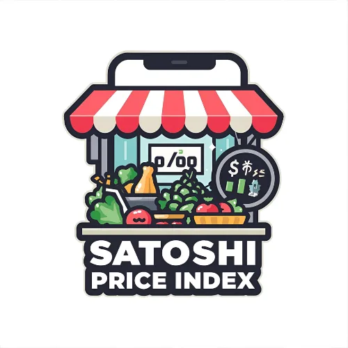
See the price of a dollar and everyday goods in satoshis over time.
Case Study
Bitcoin price charts usually frame everything in dollars, which hides the more interesting question: how many sats does everyday life actually cost?
Ceboruco built a data-forward Nuxt app that flips price charts around, tracking dollars and common goods in satoshis with simple historical visualizations.
The app gives Bitcoiners a more intuitive way to think in sats and understand purchasing power instead of only watching fiat price swings.
The Satoshi Price Index flips the conventional price chart on its head. Instead of showing how many dollars one Bitcoin costs, it shows how many satoshis (the smallest unit of Bitcoin — 1 sat = 0.00000001 BTC) it takes to buy a dollar, a cup of coffee, or a gallon of gas.
This inversion reframes inflation from the Bitcoin perspective. When the sat price of a dollar drops over time, it means Bitcoin is gaining purchasing power. The app tracks several everyday goods and plots their satoshi cost historically, giving users an intuitive sense of how Bitcoin's value proposition plays out in real terms.
Built with Nuxt 4, the app fetches Bitcoin pricing data and renders interactive charts. The design is data-forward — charts and numbers dominate, with minimal chrome around them. It's a tool for Bitcoiners who want to think in sats, not dollars.
Send the problem, timeline, and budget range.